SAIL SAND POINT
A non-profit seeking a digital refresh.
Sailing for all ages.
MY ROLE
UX/UI Designer
Brand Identity
Information Architect
My role in this project was to rebrand and redesign Sail Sand Point’s current website to highlight a more modern and playful feel that better showcases the organization’s culture and community-based mission statement. This was a capstone project for my UICP course at School of Visual Concepts, and an opportunity to work with real life clients. After our final presentations, the client has the option to commission the student’s design work, although this does not always happen.
TOOLS
Figma (Wire-framing, Prototyping)
TIMELINE
10 Weeks
OVERVIEW
For nearly 25 years, Sail Sand Point (SSP) has delighted Seattle through their sailing programs. But with the recent coronavirus pandemic, their back-logged plans to update their digital presence became priority #1.
As a non-profit sailing organization based in Seattle, WA, Sail Sand Point’s mission is to bring the joy and life-enhancing benefits of sailing to people of all ages, abilities and backgrounds. When presenting their case, I was struck by their generosity in wanting to give back to the community - particularly those with less resources - and to spread the joy of sailing through their various programs. Their mission statement is their culture, and this was evident during the zoom call with Rachel (Director of Administration) and Seth (Executive Director).
Their hope and goal was simple: build an improved, more modern feeling website.
The Problem.
SSP’s website needed a responsive and renewed design.
Sail Sand Point’s current homepage.
Problems - some big, some small.
Navigation menu - because of its 9 different top-level categories, a user gets confused with where to find specific topics.
There are lengthy threads of small text that are difficult to read on the homepage and across the site.
No grid to create visual hierarchy or structure.
My Solutions
Condensing child and parent pages down to 5 main categories.
Less text, more visuals - narrow text threads in order to make reading easier, and utilize “read more” buttons for longer copy.
12-column grid (desktop) and 1-column grid (mobile) to restore site structure and organize content information.
At its core, the new design needed to be responsive and modern.
RESEARCH
COMPETITIVE ANALYSIS
I was given three different competitor websites from the client as references, and each were used as references for unique traits that SSP were looking for in their own site.
Salish Sea Expeditions
Simple, honest design
6 top-level nav pages
A good balance of visuals-to-text
Northwest Maritime Center
Responsive design with a simple 3-column grid layout
A “Donation” CTA at the top
Good branding and overall theme
Outdoors for All
A carousel as a hero banner to cycle through recent events
Testimonial videos to excite new prospects
My persona was based on Jessica: a busy recruiter by day, and a mother of 3 children by night.
Jessica’s needs were specific: she doesn’t want to waste time solving the mystery of where resources and information are hidden. She wants to find out about Sail Sand Point as an organization and not waste any of her precious time doing it. With a keen interest on local businesses and especially non-profit organizations, it was important that she felt invested through supporting for a cause that she felt connected to at a personal level.
USER SCENARIO
“As an adventure-seeker, I’d like to find out more about the staff at Sail Sand Point so that I can feel more connected with the organization while enjoying their services.”
Jessica wants to know more information on SSP by searching “about” and gets some suggestions in the results.
FEATURE
While SSP’s current website contained a lot of useful information, it lacked organization and structure. A search capability would be a huge benefit for a user like Jessica, and would keep her coming back to the site.
30% of navigation on sites involves searching key words. In order to make this feature a success, I wanted the Search icon to be easily found and allow for placeholder text for suggestions on keyword searches.
Hovering over a suggested placeholder text will show a green overlay for the Desktop viewport.
SITEMAP
As a second major component of this case study, rethinking the sitemap required a lot of planning and preparing upfront.
Current sitemap: With 9 parent pages, 43 child pages, and 23 sub pages, my goal was to condense individual sub pages that contained information that could be included with other categories (ex: “Contact Us & Directions” and “Hours”)
New Sitemap: The new sitemap has 5 parent pages and included a lot of “Sections within a page” to curate more content per page and eliminate “dwarf pages” from their navigation. This was accomplished by thoroughly combing through each page on SSP’s current site to analyze what content could be combined, and in the process discovered that a good handful of the sub pages included only a paragraph of copyright, and nothing else.
CURRENT SITEMAP
The current sitemap is a smorgasbord of individual links, often containing hidden sub pages within sub pages. My biggest challenge was to reduce the number of individual links.
NEW SITEMAP
The new, stripped-down sitemap offers ease when it comes to navigation, and required combining and condensing of orphan pages into main categories.
DESIGN
As with most case studies, my design process began with the history of the organization and understanding Sail Sand Point’s mission. There was a strong culture of community and an outreach to those with lesser resources.
SSP’s request to build a “modern feeling” website was at the forefront of my mind. I don’t normally begin with designing logos, but for this particular project that’s where I started
LOGO ANATOMY
MOODBOARD
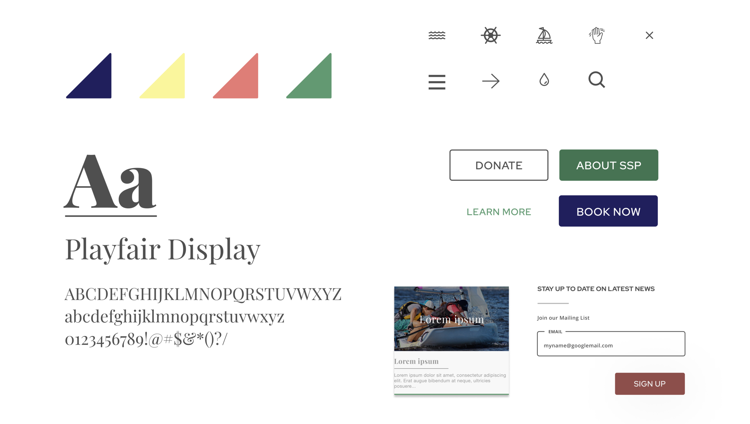
The Moodboard has a mixture of pastel colors, fun line art to provide texture, imagery and versatile type families that have a variety of weight to provide effortless hierarchical structure.
STYLE GUIDE
Color - Water, Sun, Salmon, Seaweed.
Icons - Icons and illustrations to represent SSP’s fun side and make Jessica feel welcome.
Type - One serif (Playfair Display), one sans-serif (Red Hat Display) to add contrast.
FINAL DESIGN
HOME PAGE
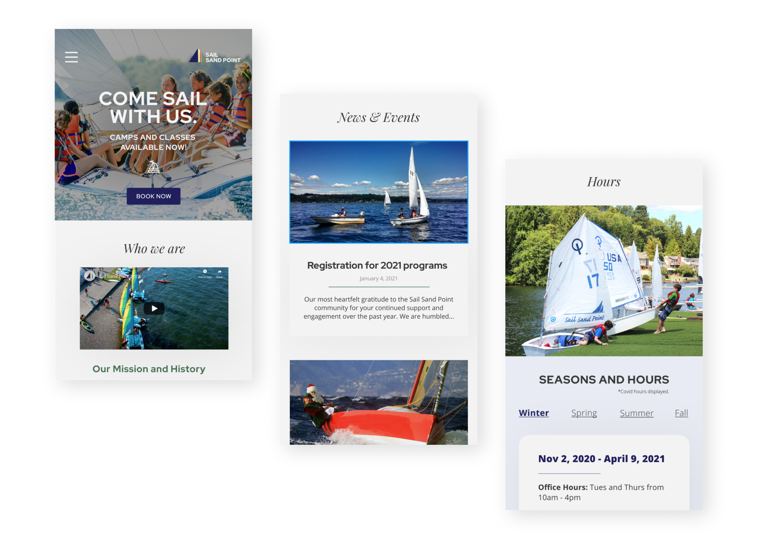
Sail Sand Point’s new Home page now has a hero image that is fun and inviting and better represents SSP’s culture. The CTA button quickly routes visitors to their camps and classes page which has historically had the most traffic on their site and also drives their business revenue. I wanted to incorporate a short summary of who SSP is, and also provide a button to navigate the user to the “About” page (see below for screenshots of About page). The remainder of the Homepage contains a Highlights and News & Events section, an Hours and Location blade, some of their sponsors, and a footer that is consistent across each page of their site.
Screenshots of the Desktop viewport for the Home page.
Screenshots of the Mobile viewport for the Home page.
ABOUT PAGE
Sail Sand Point’s new About page has a full blade interface consistent to the homepage which aligns with their goal of going for a modern look and is effortless when it comes to designing for a responsive site. A lot of time and planning was spent upfront organizing and condensing their content that had been dispersed across multiple child pages. I envisioned and executed a final design that is easily navigable via vertical scrolling, which is great for both Desktop and Mobile viewports.
Screenshots of the Desktop viewport for the About page.
Screenshots of the Mobile viewport for the About page.
FEATURE: Search
Screenshots of Jessica using the Search engine to read up on SSP’s About page. The automatically generated placeholder text helps Jessica with her search by providing suggested links and pages.
CONTINUED EFFORTS
At the end of my project, I had the chance to present my final design in front of a panel, which included Seth and Rachel from Sail Sand Point and other students from my SVC’s program. SSP later reached out to me via email and expressed their excitement around my work and hired me as their web designer.
Sail Sand Point and I are currently working out project plans and timelines to incorporate my design mock-ups into their website production. I will be working closely with a developer and a team of members from SSP to build out their new design plans. Stay tuned.


