EL CHUPACABRA
Bold flavors, busy nights, and a website that could use more spice
Grungy burritos
MY ROLE
Web Redesign
Brand Strategy and Identity
Information Architecture
My role was to rebrand and redesign El Chupacabra’s website into a fully responsive experience (desktop, tablet, and mobile), creating a user interface that feels both welcoming and enjoyable to browse.
TOOLS
Figma, Illustrator
TIMELINE
10 Weeks
OVERVIEW
El Chupacabra is a Mexican restaurant with a mascot inspired by the legendary cryptid — a fitting symbol of Seattle’s quirky culture. With popular locations in Alki Beach and Greenwood, they’re known for strong happy-hour drinks, friendly service, and crowd-pleasing tacos and enchiladas. However, while the dining experience is vibrant and memorable, the website felt dated and left users questioning whether it had been updated in recent years.
Despite being a local favorite, El Chupacabra’s website left much to be desired. To better capture the brand’s essence, I visited their Greenwood location to experience it firsthand. Over a happy-hour margarita, I got a sense of the restaurant’s culture and clientele — grungy and quirky, yet family-friendly and a true escape from the everyday. My goal was to reflect these traits in the redesign while bringing a modern, cohesive feel to the overall brand.
The Problem
While El Chupacabra’s vibe is delightfully grungy, their website needed a modern refresh to match the dining experience.

ACCESSIBILITY ISSUES
Chupacabra’s homepage uses bold colors and a variety of typefaces, but the lack of legibility creates challenges, especially for users with visual impairments. Even with strong eyesight, elements like the bright red header were difficult to read.
MULTIPLE HOMEPAGES
Although El Chupacabra has only two locations, they maintain separate domains for each: elchupabraseattle.com and elchupacabraalki.com. This caused confusion as a first-time visitor — clicking on a location would take me to a page within the same domain, not the separate domain I expected.

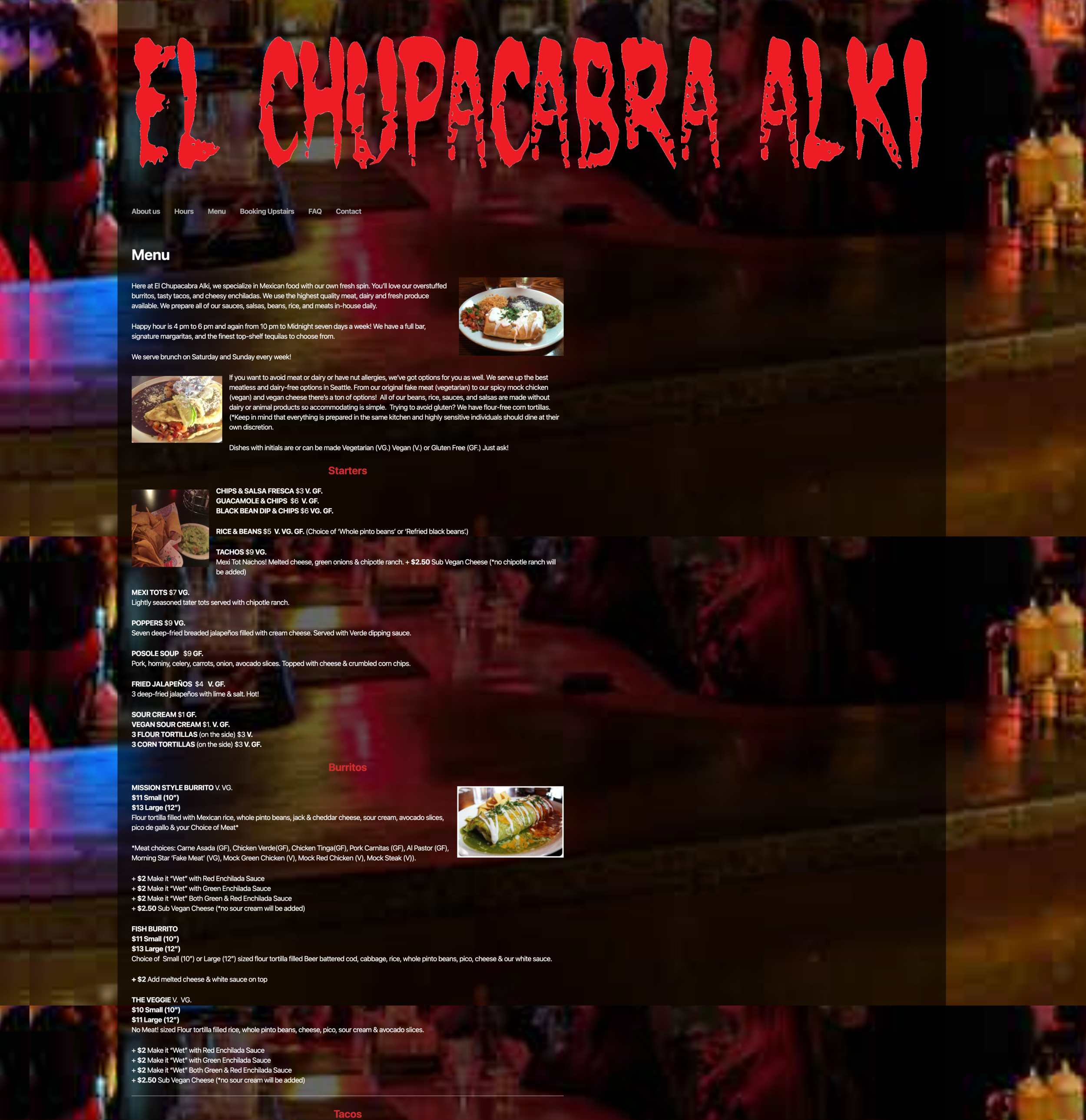
CLUTTERED MENU
Chupacabra’s menu was difficult to navigate due to inconsistent structure and duplicate information across categories. Beyond usability, it missed an important goal: inspiring appetite and excitement for the food.
The goal
Redesign El Chupacabra’s website to be fully responsive across desktop, tablet, and mobile, while creating a refreshed brand identity that reflects modern restaurant aesthetics and appeals to a broader audience seeking a vibrant, “LA-style” experience.
RESEARCH

COMPETITIVE ANALYSIS
I used El Catrin’s homepage as inspiration for Chupacabra’s redesign, drawing on its modern art style, textures, and illustrations. The bright colors evoked tacos and margaritas, a playful vibe I aimed to capture while giving Chupacabra a fresh, lively look.

I opted for a one-page design to keep the focus on high-level information: recent updates, menu, an expandable bio, and location details.
BRANDING + DESIGN
To start, I came up with a few words to describe El Chupacabra’s current brand. This dictated the mood of my style board, which later helped in establishing the idea of using color-filled geometric shapes to represent the various foods from their menu.


WIREFRAMES
I started with a mobile-first approach, which helped streamline component resizing and ensured a consistent layout across all viewports.
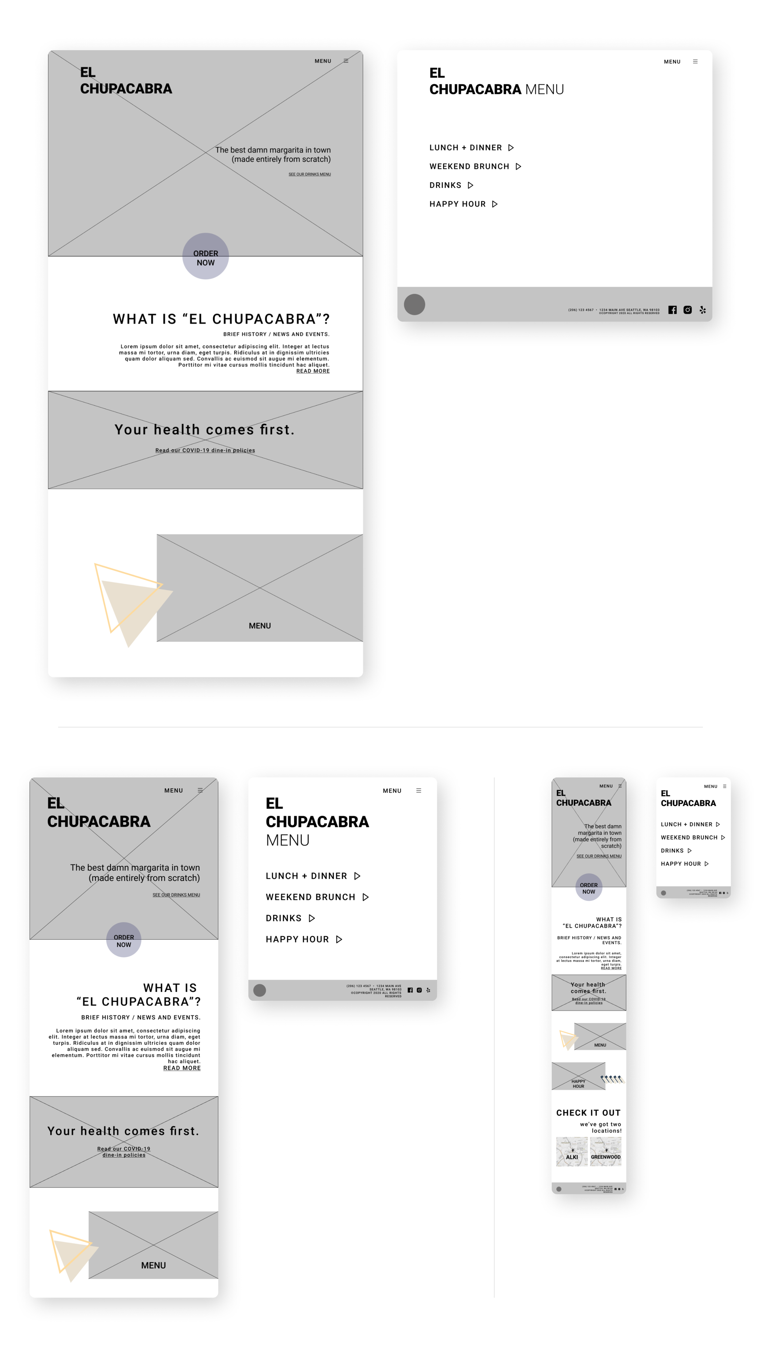
From top to bottom right: Desktop, Tablet and Mobile viewports.

Moodboarding & Branding
In the moodboarding stage, I explored soft, geometric shapes as branding elements, each representing a unique food or beverage from the menu. The color palette was designed to evoke appetite while drawing inspiration from the papel picado banners hanging inside the restaurants. To modernize the aesthetic and align with a hip, LA-style Mexican bar vibe, I incorporated neon-inspired accents.

Typeface
Choosing the right typeface was key in defining the brand’s identity. I selected Greycliff CF for its circular, geometric forms, which complemented the design elements and shapes used throughout the project. It became both the foundation of the logo and the primary font for the website redesign.

Illustrations
The illustrations used for the different food items on the menu share a similar color and branding scheme as the colors + shapes theme (above), and also adds a flavor of fun personality and a nod to modern design.
FINAL DESIGN


Header + CTA
A bold hero header was central to the redesign, addressing a key weakness of the original site. The bright colors and geometric shapes stand out against a dark backdrop, improving readability and drawing attention to the primary calls to action — making it simple for visitors to view the menu and place an order.

menu layout
The new layout organizes Chupacabra’s offerings by category, with expandable sections that reveal content on the same page — avoiding the distraction of opening new windows. A two-column grid improves readability and delivers a cleaner, more efficient experience compared to the original disorganized menu page.

location info
Chupacabra’s two locations previously caused confusion, with each operating under a separate web link despite sharing the same business model. To streamline the experience, I consolidated both into a single, clear layout placed at the bottom of the homepage.
PROTOTYPE
The video below demonstrates a user journey on the tablet viewport, browsing the single-page homepage and exploring the Lunch + Dinner and Weekend Brunch menus.