KEXP mobile app redesign
ROLE
Mobile design
Rebranding
OVERVIEW
KEXP is a beloved Seattle-based radio station with a rich history dating back to 1973. Known for its commitment to independent and local music, KEXP reaches over 200,000 weekly listeners and has become a cultural staple in the Pacific Northwest. Despite its strong brand presence, many fans remain unaware of the station’s mobile app—and its potential to connect users to KEXP beyond the airwaves.
One of KEXP’s most popular offerings, Live on KEXP, showcases intimate in-studio performances by emerging and established artists. With millions of views on YouTube, it’s a cornerstone of their identity—and a personal favorite of mine. I saw an opportunity to bring this feature to the forefront of the mobile experience while addressing broader usability challenges and increasing engagement with the app.
Problem

From the user’s perspective, the app lacked a clear purpose and suffered from inconsistent design. Since the core experience centers around the radio and Listen Live sessions, integrating Live on KEXP video performances felt like a natural extension—one that could enhance the experience and help drive more engagement with the app.
No onboarding or tutorial for a landing page that seems unintuitive.

“Live on KEXP” videos missing as a menu navigation.
Inconsistency with color schemes throughout the app.
Research
To validate my hypothesis about Live on KEXP and to kick off my research, I created a user interview survey using Google Forms to gather first impressions of the KEXP app—focusing on what worked, what didn’t, and what users felt was missing. I interviewed 7 participants, with questions centered around their music listening habits and familiarity with KEXP. Topics included music listening preferences and experience with KEXP radio as well as using the app.
Feedback highlighted user expectations and feature requests, with several participants specifically mentioning Live on KEXP as something they’d love to see integrated into the app—echoing a sentiment I shared and validating my hypothesis.

LIVE ON KEXP
With nearly 2.5 million subscribers on YouTube, Live on KEXP drives a significant portion of KEXP’s online engagement. I saw an opportunity to bring this popular content into the mobile app—and user interview responses confirmed that others were looking for the same experience.
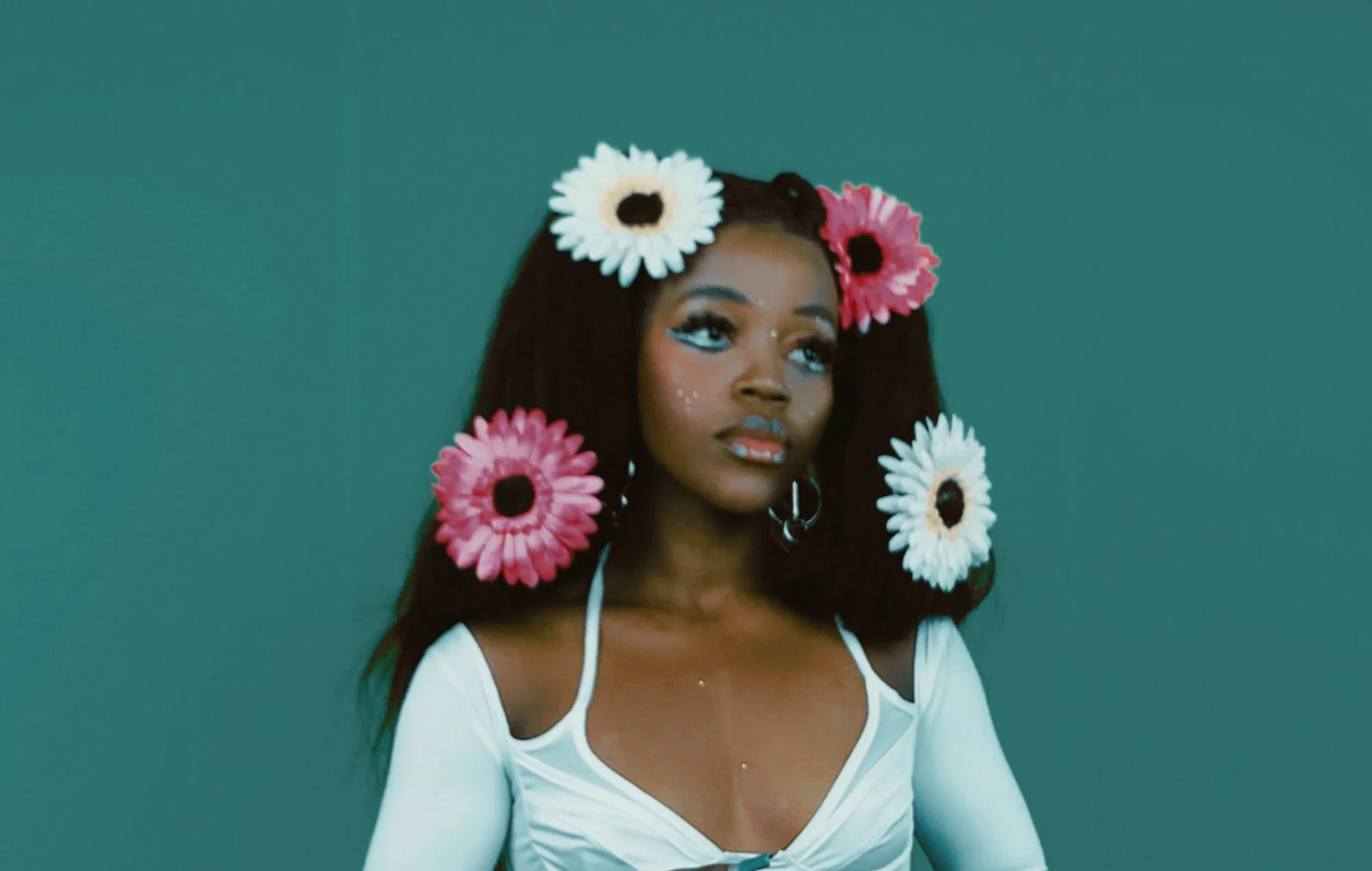
Photo: Tkay Maidza, a performing artist at KEXP

Pronouns: He/him
Age: 27
Occupation: Registered nurse
jason, my persona
Wants to feel more connected to the local music scene by attending shows and experiencing live performances.
Enjoys sharing what he’s listening to on social media to spread the word about KEXP and the artists he supports.
User need
Mainstream music streaming apps like Spotify don’t make it easy to discover local music.
Users love the Live on KEXP series on YouTube, but find it frustrating to switch between apps—they wish it were accessible directly within the KEXP app.
pain points
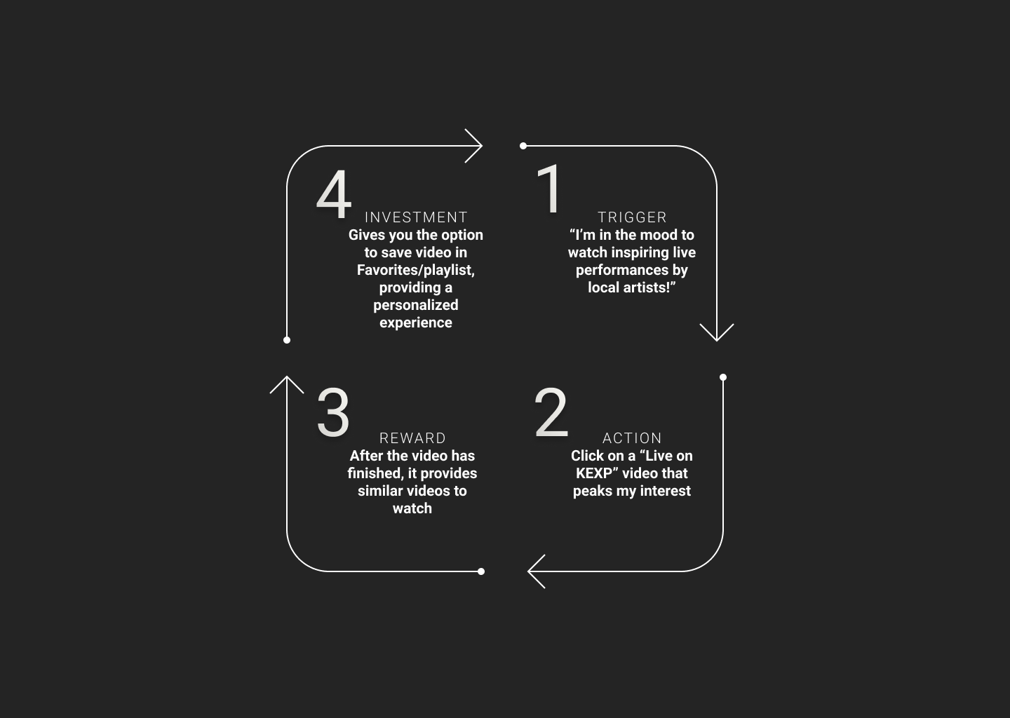
core loop
To validate my feature choice, I designed a core engagement loop that encourages continued app usage and deepens user investment in the KEXP ecosystem.
-
“I’m in the mood to watch inspiring performances by local artists.”
-
Click on a “Live on KEXP” video that peaks my interest.
-
After the video has finished, it provides similar videos to watch.
-
Gives you the option to save videos in Favorites/Playlist, providing a personalized experience.

Start
The Annotated Sketches shows Jason’s journey, starting from the Nav Bar, and selecting “Live on KEXP”.
Choose
The Live on KEXP landing page gives Jason a list of video options to choose from.
Play
Once Jason selects a video and plays, he has several next step options. In this scenario, he chooses to add the video to a new playlist.
Save
Adding to a playlist is simple. With a click of a few buttons, Jason can add his video to a playlist for watching later.


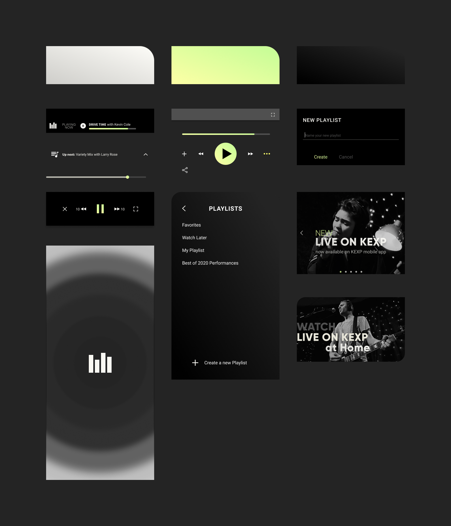
DESIGN
My design process began with immersing myself in KEXP’s history and community, while also analyzing competitor platforms like Spotify and Apple Music to understand industry standards and opportunities where kexp could stand out.
From there, I defined five brand words that captured the vision for KEXP’s refreshed mobile experience.

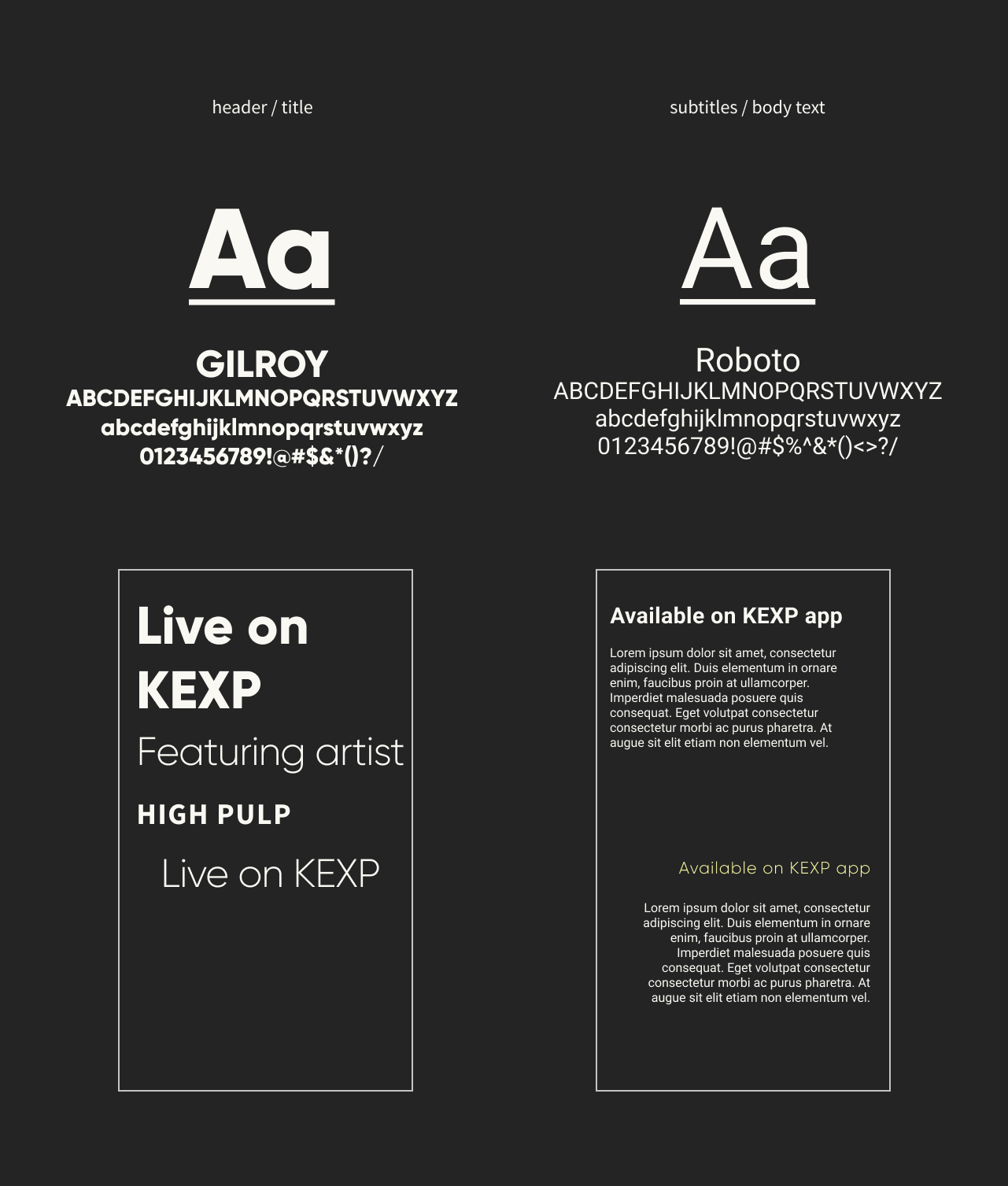
Style Guide
Color - The color palette was inspired by KEXP’s existing dark theme, enhanced with vibrant pops of light. A yellow-to-turquoise gradient was introduced to add a modern edge and visual energy to the overall design.
Logos - The original KEXP logo remained untouched to preserve brand identity. However, I explored color variations using tones from the new style guide for subtle integration.
UI Components - The interface follows a minimalist approach with clean lines, generous padding, and thoughtful spacing. The gradient accents bring a touch of flair and modernity without overwhelming the user.

Typography - Gilroy was chosen for headers due to its contemporary, geometric style, which pairs well with Roboto—a versatile and familiar typeface used for subheaders and body text. Together, they create strong visual hierarchy and readability
Icons - All icons were custom-designed for this project, ensuring a cohesive and consistent visual language throughout the app.

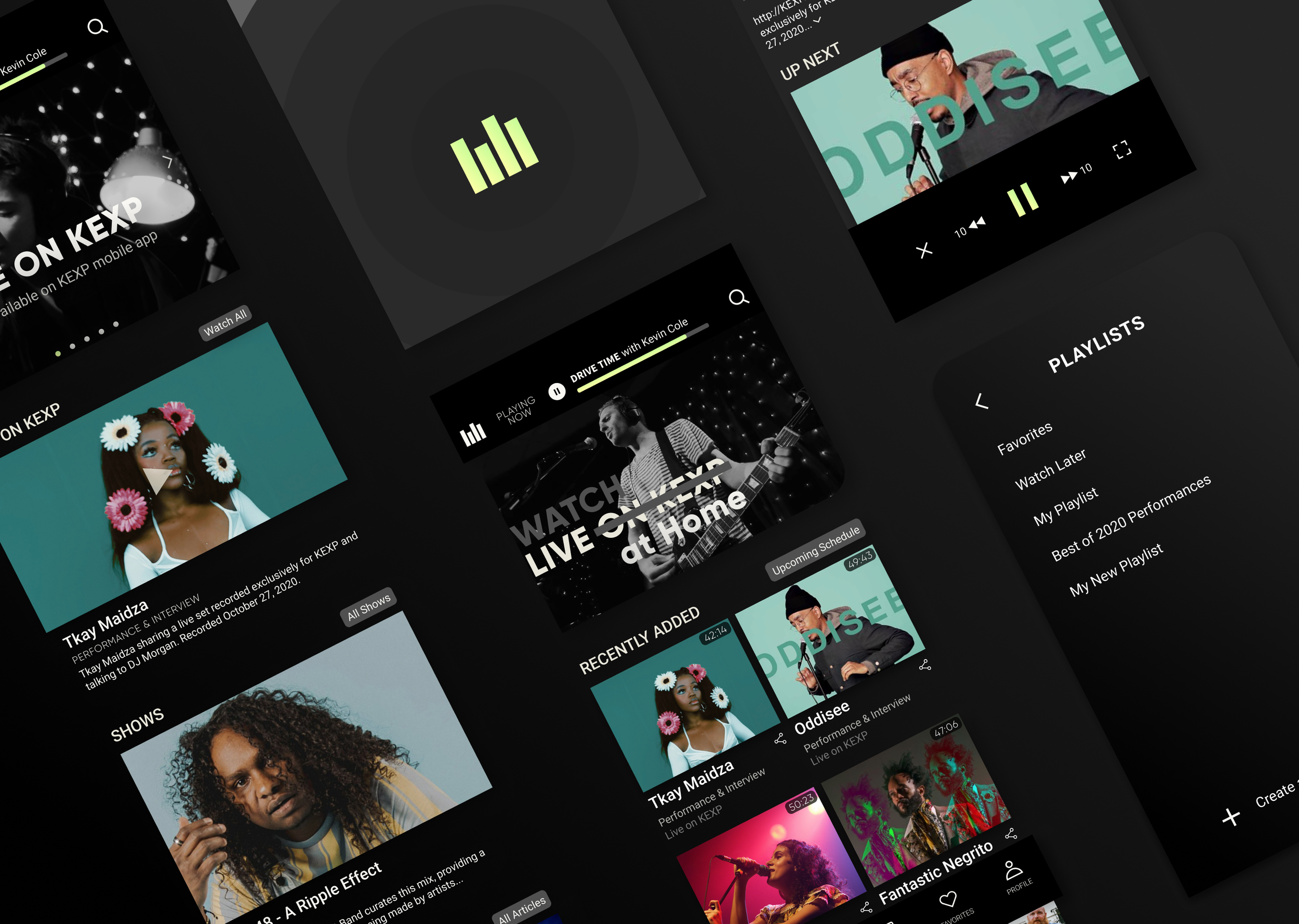
FINAL DESIGN
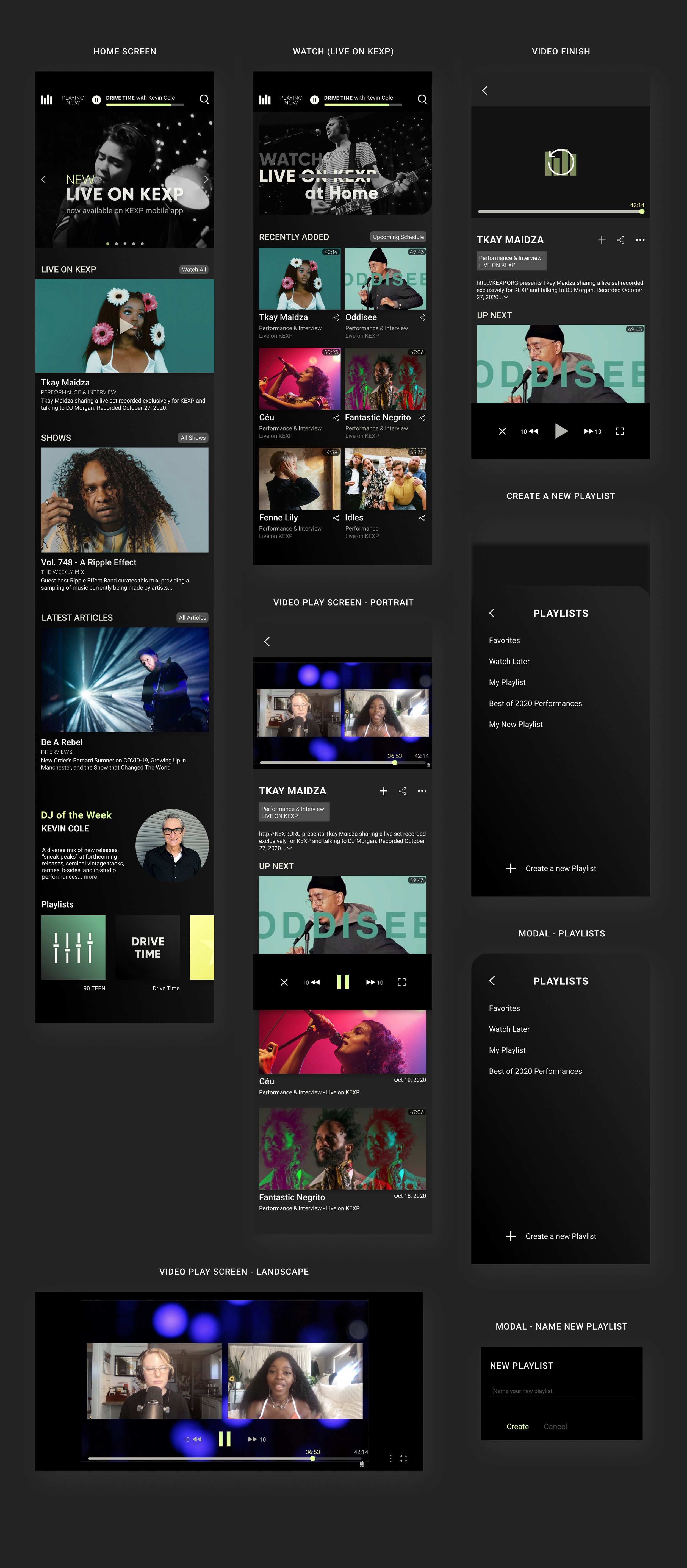
PROTOTYPE
User scenario walkthrough of viewing a Live On KEXP video and adding to playlist.

Final Thoughts
My final prototype introduces a refreshed KEXP experience:
A bottom navigation bar that creates familiarity and consistency, resolving the app’s previous navigation challenges.
A unified design system applied across all UI components for a cohesive look and feel.
A brand-new “Live on KEXP” feature, giving Jason direct access to live performances right from the app.
Continued Efforts
Given the 10-week project timeline, here are areas I would expand on with additional time:
Conduct further iterations informed by user testing.
Redesign and rebuild the remaining areas of the app’s information architecture.